Features
Printing
A latex story
Light Visions creates an immersive sensory experience with large-scale graphics
November 23, 2021 By Nithya Caleb
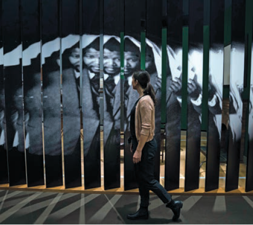
 The visual elements of the Mandela: Struggle for Freedom exhibition were printed and fabricated by Light Visions on HP 3600 latex printer. Photo © Aaron Cohen. Photos courtesy HP
 The show-stopping Mandela: Struggle for Freedom exhibition is continuing its successful run across North American museums. The exhibition was produced by the Canadian Museum for Human Rights (CMHR), Winnipeg, in collaboration with the Apartheid Museum in Johannesburg, South Africa. It debuted at CMHR in 2018. In 2019, it began travelling across North America, most recently to the Illinois Holocaust Museum and Education Center, Skokie, Ill.
Exhibition details
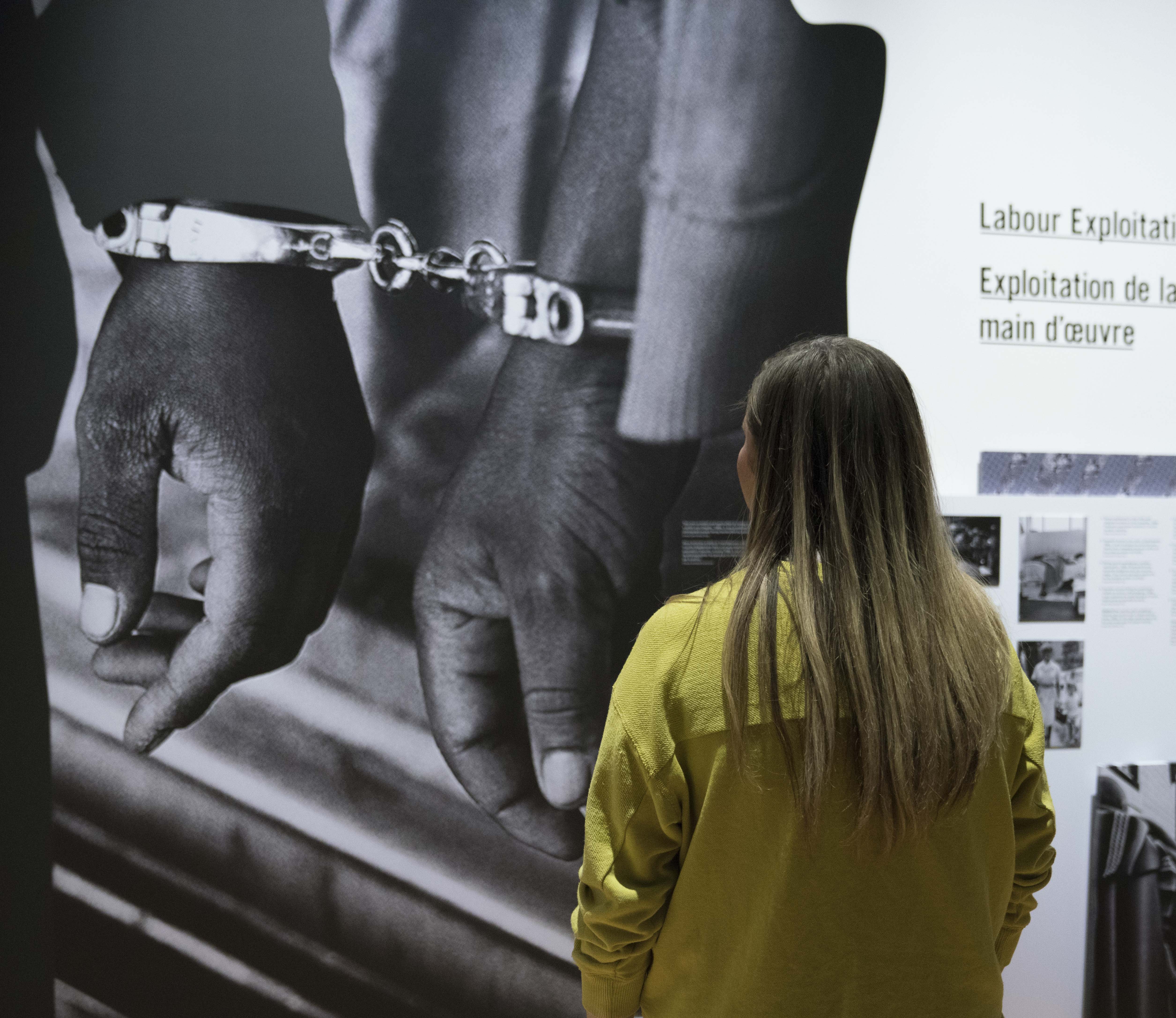
Mandela: Struggle for Freedom takes visitors through the story of Nelson Mandela and the struggle of Black and other non-white South Africans for freedom from colonial rule and apartheid.

Rob Vincent
“This was our first blockbuster travelling exhibition since the museum opened. We wanted to create a sensory, immersive experience utilizing scenography and large-scale graphic elements,” explains Rob Vincent, acting director of design and innovation at CMHR.
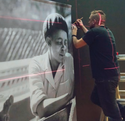
Key visual components of the exhibition were printed and fabricated using HP Latex 3600 technology by Light Visions, a Winnipeg-based specialized printing company, in spring 2018. Light Visions used a variety of materials like vinyl, paper, acrylic, wood, steel and fabrics to create textile banners, wallpaper and vinyl wraps. This contributed to the rich sensory experience featuring dramatic visual elements and original artifacts.
Light Visions printed 280 to 300 image and text panels and large-scale murals. All the panels were uniquely built.
The project comprises 18 murals. The biggest one is 33 x 11 ft. Light Visions also created 71 vinyl wrapped story and text panels. These panels were joined together to create massive panel clusters.
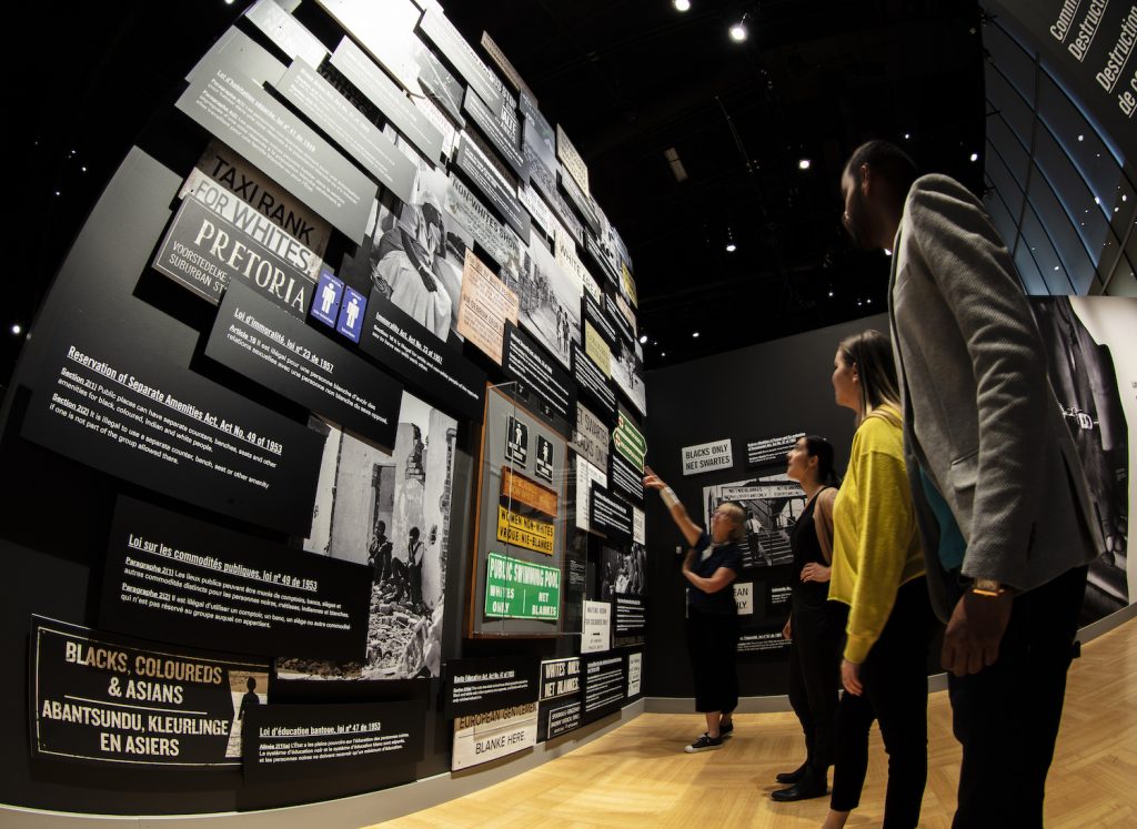
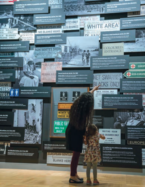
The exhibit also includes a dramatic “Wall of Laws” that visually illustrates the oppressive rules of apartheid, the system of racial segregation that existed in South Africa until 1994 when Nelson Mandela became the country’s first democratically elected president. The Wall of Laws comprises 74 printed panels.
Light Visions created large graphics with scenographic elements to anchor the different sections of the exhibition. Photos © Jessica Sigurdson
Design concept
The museum’s project team wanted to use materials that were relevant to the time frame and area where the story was taking place. As a result, wood and steel are used throughout the exhibition, as well as vibrant graphics and typographic treatments, explains Vincent.
The exhibition itself is divided into five chapters. The Wall of Laws anchors the “Apartheid” chapter. For the “Defiance” chapter, a living room set in the sixties shows how people were fighting apartheid. A life-size scale of Nelson Mandela’s jail cell anchors the “Repression” chapter. “Mobilization”, the fourth section, is headlined by a life-sized Casspir tank to show visitors what it was like to defend oneself from tanks with garbage cans. Finally, the last chapter, “Freedom”, is a celebration of South Africa’s first democratic elections and Mandela’s win.
For each chapter, the curators wanted to create a large anchor with scenographic elements to emphasize that particular section. This approach is exemplified by the Wall of Laws, a tall mural consisting of laws and signs that were used in South Africa at that time to enforce the system of apartheid. The Light Visions project team ensured all signs were printed on the substrates (e.g. plastic, wood, steel) that were used originally to ensure authenticity and potentially transport visitors to South Africa.

Allan Brooks
Allan Brooks, president, Light Visions, recalls distressing plywood to ensure it looked like the wooden sign panels used in South Africa. The team also deliberately rusted metals before printing on them.
In the end, “the signs we created blended seamlessly next to the original signs,” says Brooks.
“The only difference between the installation and the actual artifacts is that the latter are behind plexiglass. Other than that, you would have a really hard time differentiating the two,” adds Vincent.
A lot of the textures used in the exhibition resemble shweshwe, a fabric that was brought into South Africa by Europeans. Though its origin is colonial, the South Africans made the fabric their own by adding vibrant colours, patterns and textures.
“In the beginning of the exhibition, the colours are quite dull; just black and white, but as the story progresses, you’ll see other patterns and colours including blue, green, red and yellow. If you look back at exhibition at the end of it, you will see all the colours of the South African flag coming together in unity,” describes Vincent.
Some panels used in the exhibition had a modular design to enable easy assembling and disassembling.
Equipment
Nearly 90 per cent of the exhibition was printed on HP 3600 with latex technology.
“We can print just about anything on the HP 3600. It has a lot of controls. It is also eco-friendly since it is latex,” says Brooks.
The Wall of Laws was direct printed with UV inks.
Wall of Laws
As mentioned earlier, the Wall of Laws is a 17-ft tall wall comprising printed laws, signs and photos. It is a challenging concept. Since the show was travelling, the project team had to create a modular design. The modular panels also had to fit together so that the installed exhibit looked like one seamless piece.
“The Wall of Laws isn’t just a collection of panels stuck on the wall. They all overlap, and are at different levels. Further, they had to be mounted to plywood panels. It is a really complicated piece. Also, we didn’t want them to look like they were mounted to plywood panels. They had to look like they were literally floating off the wall. It was a tremendous challenge,” recollects Brooks.
Light Visions used a variety of materials to create textile banners, wallpaper and vinyl wraps.
Easy assembling
One unique feature of the exhibition is that the large, integrated story and text panels were built to be assembled with the ease of an Allen key to make crating and assembly easier.
“We refer to these panels as monoliths. Each monolith has three or four 1- to 3-in thick panels, each over 300 lb. We managed to reduce the weight in half by hollowing out the backs of the panels without affecting the overall look. Now, they all had to be assembled and disassembled. So, we came up with a system to assemble them with Allen keys. We even designed custom wall hardware for them because they had to be lifted onto the wall. We wanted to ensure the assembly was easy for everyone,” explains Brooks.
Value engineering design
The initial design plan exceeded the budget. The Light Visions project team had to fit the design vision into the budget.
“One of our biggest challenges at the beginning was figuring out how we were going to produce the exhibit without losing the impact and at the same time stay within budget. I think we were successful in that,” says Brooks.
Quality
Typically, exhibition panels will have to be reprinted if they are travelling to several locations, due to normal wear and tear. However, this exhibition “is still almost the same as it was, which is phenomenal,” says Vincent.
Successful show
The exhibition was a huge success for CMHR, which had an increase in visitors. Around 80 per cent of visitors came for the exhibition. This was the largest and most complicated exhibition for Light Visions since a Jane Goodall exhibit.
“We love working with CMHR because they constantly challenge us with new designs and initiatives. Rob always likes to raise the bar, and my staff loves the challenge,” says Brooks.
This article originally appeared in the November 2021 issue of PrintAction.
Print this page