Application
News
Developing the brand identity for a Canadian cannabis company
October 15, 2018 By PrintAction Staff
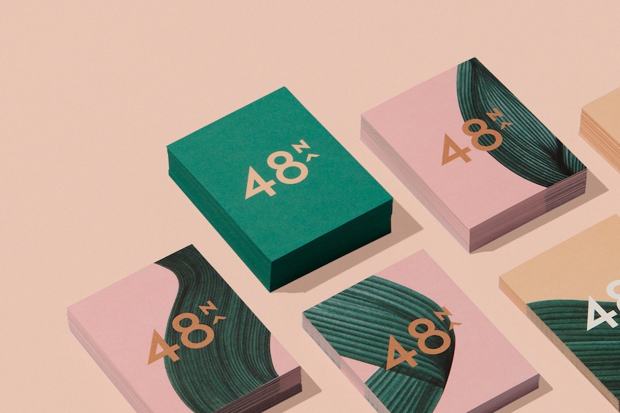
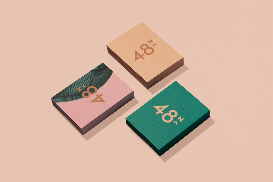
48North Cannabis Corp., a Canadian women-led cannabis company, describes itself as the country’s only licensed cannabis producer focused on the female health and wellness market. Determined to reimagine the landscape of cannabis for women, it recently worked with Toronto-based Blok Design to create a brand identity that would reflect its distinct philosophy and visionary approach.
“With [its] main focus being women, we set out to create a brand that would represent the expansiveness, the boldness and the clarity of a company that is challenging preconceptions and opening possibilities,” says the design studio, adding that its intent was to create a “deeply personal, intuitive experience.”
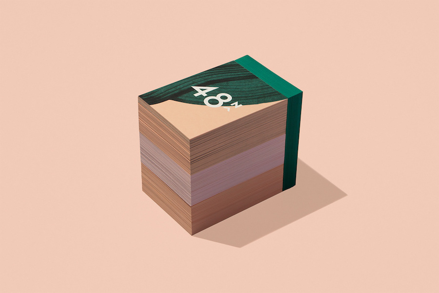
Featuring a warm colour palette of pink, beige, tan, orange and green, the new brand identity was unveiled this summer, showcasing how design plays a critical role in establishing new ways of communicating.

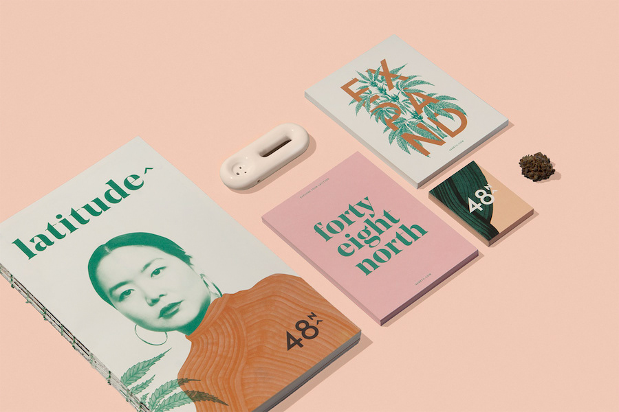

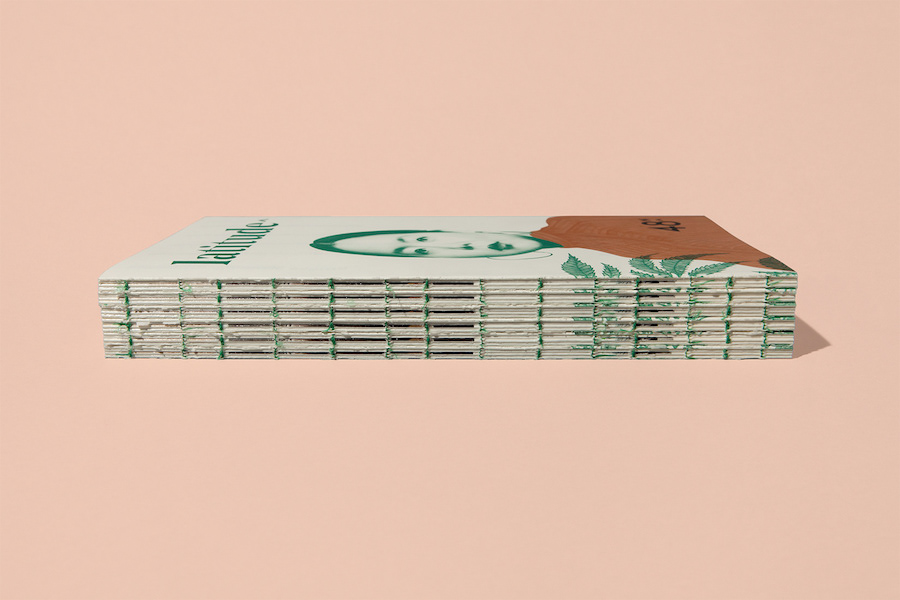
The identity unveiling coincided with the launch of Latitude, 48North’s new online platform intended to empower, educate and break taboos by sharing experiences, infographics and photo essays of women and their cannabis use.
In addition to Latitude, Blok Design also created postcards, packaging for boxes, business cards and a line of products.
This article was originally published in the October 2018 issue of PrintAction, now available online.
Print this page