Features
Chronicle
Opinion
Every dog has his day
A lesson on why printers shouldn’t only rely on fads
November 6, 2019 By Nick Howard
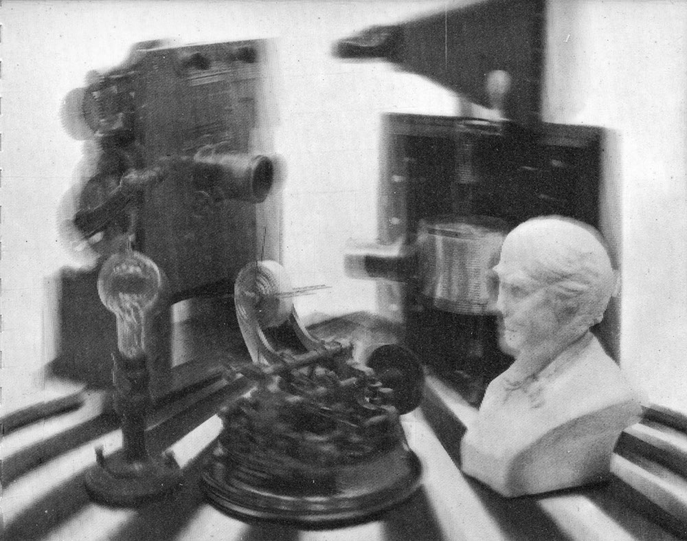 Printing Magazine/National Lithographer, 1964 - 03, vol. 88, page 63.
 As a kid growing up in Montreal, Que., my parents had a good friend who owned a French-made Citroën DS. Almost every time Mr. Hagen would come over, I’d run out of the house and plead with him to show me how his car would magically go up then down. The whole body of the car would slowly rise and descend with the turn of a knob. It was magic!
There was nothing like that 1960 model DS anywhere, and with how it was designed, it looked like a rocket ship. Even Flash Gordon’s spacecraft never looked this cool. Citroën called the self-levelling feature ‘Hydropneumatic Suspension’ and boy, did it make my dad’s 1959 Chevy look drab in comparison.
As I learned later in life, there were many more unique features in that Citroën, but rarely do I see one anymore. What crawls out of the minds of designers and engineers astounds me. Ironically using the Citroën DS as an example, few ideas that seem like a winner on the drawing board become a success.
Case in point is the earliest development of what we today call lenticular printing. In the February 25, 1964 issue of LOOK magazine, a small postcard insert displayed what was then described as a parallax panoramagram. The initial process was said to have been patented by Dr. Edgar Fuller in 1938, but it wasn’t until LOOK’s Vice President Marvin Whatmore turned his eye to it to boost the circulation of the magazine. In 1950, the parent company of LOOK, Cowles Magazines & Broadcasting Inc., worked to design a special 3D camera and a plastic substrate that would adhere to an image. Later Eastman Chemical Products Inc. (Kodak) and Harris-Intertype Corp. were roped in to add their know-how and research labs to the effort. These early results, although promising, still required viewers to wear special glasses to see the 3D effect.
Fourteen years of testing and modifying came to fruition with that insert in LOOK. The first three-dimensional printing ever achieved went to the homes of several hundred thousand people. Epoline hot-melt plastic was applied to a specially built Harris offset press, which when cooled against a corresponding mold, provided the prismatic lines to create the 3D effect.
I happen to have one of those 3D cards. It is a paperback piece with the newly developed Kodak polyester fibre lens material – Kodel – and features a black and white photo of Thomas Edison surrounded by five of his most notable inventions. Looking at this sample today, I can’t see what the fuss was all about — the sample is at best amusing; comparisons to modern lenticular material are stark at best.
The printing industry has always jumped at any opportunity to differentiate themselves from mass media. The unique offerings of print had no competition. The 1920s to 1970s were the boom years where design trumped just about everything else. Typography was prolific, but before phototypesetting, every printer had to ‘buy’ his fonts or matrices to draw customers. With the arrival of phototypesetting, the cycle of expenditures would begin all over again. The music industry would replicate this agony when vinyl records made way for 8-track tapes then cassettes, which led to CDs and now MP3s. Each time, the customer bore the brunt of a technology that forced obsolescence.
Print seems to have forgotten the lessons of early 3D printing, even though lenticular substrates are genuinely fantastic. The problem is that what Mr. Whatmore assumed would be a significant breakthrough, never lived up to the promise of 1964. Lenticular is often used today but is relegated to a very tiny segment of what you can do for your customers.
Ultraviolet printing arrived in great fanfare in the 1960s. Small research laboratories all over the U.S. and western Europe were diligently experimenting with drying systems and inks that cure and not oxidize as with conventional oil-based inks. The possibilities were mind-blowing: Instant dry, higher gloss, and no spray powder.
The U.S. firm Royal Zenith was so enthusiastic that it installed a few of the crude UV lamps on its 26-inch half-web. By doing so, large hot-air dryers and chill-rolls wouldn’t be needed — except UV turned out to be a disaster. One company ripped out the UV after it ran into every imaginable flaw possible, including trapping and colour variation issues. Furthermore, the whole plant was covered in a brownish coating from ink misting. Early UV was plagued by everything from extreme heat and constant fires to unstable inks, tremendous power draws, and slow ramp-up times. Word quickly spread, and during most of the 1970s and 1980s, UV went nowhere fast.
Today, it’s an entirely different story. Inks have improved, lamp technology and performance are a given, and ‘instant-on’ means what it says on the label. Since 2009, 100-percent UV has taken a back seat to underlying newer technology, often referred to as low energy curing. Whether it be LED or doped UV lamps that operate on very little electricity, this technology is the culmination of over 50 years of research and failures and can be retrofitted to any offset press. Long perfectors are an excellent example. They need only two Low-E lamps to completely cure inks on both sides of the sheet and at any speed. Low-E/LED is a blessing for perfectors.
Offset presses with tower coaters, and now even digital presses, can apply coatings without the worry of drying. This ability has helped to create new forms of coatings that the majority of printers use everyday. Strike-through and reticulating varnishes provide stunning results, as does the often seen soft-touch effect. These enhancements have done marvels for our industry since being introduced about a decade ago.
But…just imagine you’re at the Frankfurt Book Fair and find yourself despondent because almost every book cover or jacket you pick up has one of these three effects. Although we love the effect and our customers love them, the euphoria won’t last. Same as Mr. Whatmore’s experiments with his early parallax panoramagram postcard — there’s not much head-turning over lenticular today. Once clients get used to soft-touch, it quickly becomes passé. If everybody has the same car or similar furniture tastes, it becomes a fad and fads don’t last. Harvest Gold appliances or Scandinavian Teak are fads that quickly come to mind.
Consumer indifference is already incubating, and perhaps your company hasn’t noticed yet. Possibly the enhancement effects of off-line digital polymer equipment is close behind. Everyone is using this technology, and when repeated continuously, customers grow weary.
One thing that never goes out of fashion is design and typography. With all the exciting new tools available on our equipment, we may be forgiven for not putting as much effort into the design itself. Pretty much any printer can use UV and the amazing varnishes and coatings, but not everyone can design a bespoke piece of print. Some because they don’t have to and still get work handed to them, others because they see no need to ruffle feathers and waste time when all their client wants is what they have created, or perhaps, they simply don’t have the talent.
As these new printing effects start to lose interest, and they will, consider what our industry has always known: Good design stands out more than anything else. Probably the best example of standing out occurs each year when the industry assembles to judge the best of print and award commendations. Want to see plenty of use of coatings, varnishes and UV inks? Check the submissions for these awards. Unfortunately, they also start looking the same.
We enjoy a steady stream of visitors at our Howard Iron Works Museum, from all walks of life and levels of interest, but the majority are artists and designers. Plenty of historically unique machinery on display, but you know what these folks want to see? Our library and type collection. Designers are searching for unique typography, and if it’s going to be printed, preferably letterpress on heavy uncoated paper, with ‘Lettra’ a particular favourite for stationery and invitations. I want to talk about this or that press, but they head for our type, and eyes light up. Searching our books from the ’20s and ’30s is a pleasure that makes them feel invigorated again. Masterful bookbinding perhaps, or perhaps the Swiss-style Akzidenz Grotesk?
The early 20th century unleashed such beautiful periods of design. The International Typographic Style movement of the 1920s made way for Bauhaus and Art Deco. Jan Tschichold’s revolutionary New Typography period opened up a design style that felt clean, bold and uncluttered. The use of Grotesk and creative silhouettes spread throughout Germany, eventually reaching Britain and North America. There is a lot you can do in black and white.
Creative typography and unique designs have no expiry date. That’s the beauty of design — not everyone can do it. The Citroën caught my attention but quickly faded away. I am no longer excited to see lenticular, and soft-touch bores me. I still enjoy reticulating varnish effects though, but for how long? The same is happening with the vast array of coating effects today. We must learn from the past and keep moving forward with an emphasis on design and not just applications — don’t always follow the herd.
This column was originally published in the November 2019 issue of PrintAction, now available online.
Print this page