Features
Design
Premedia
Pantone Reveals its Color of the Year
December 8, 2015 By PrintAction Staff
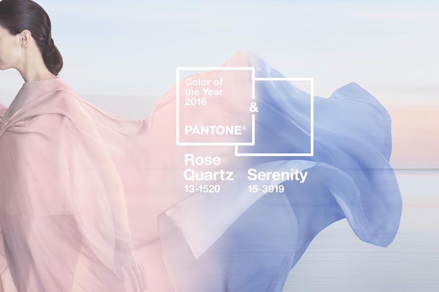 Pantone’s colour of the year for the first time blends two shades.
 Pantone, a subsidiary of X-Rite, announced its traditional colour of the year, which, for the first time, includes the blending of two shades, Serenity and Rose Quartz. The company explains its decision was based on today’s consumers who seek mindfulness and well-being as an antidote to the stress of modern day lives.
Pantone continues to explain: “Weightless and airy, like the expanse of the blue sky above us, Serenity (PANTONE 15-3919) comforts with a calming effect, bringing feelings of respite and relaxation even in turbulent times. Rose Quartz (PANTONE 13-1520) is a persuasive yet gentle tone that conveys compassion and a sense of composure.
Leatrice Eiseman, Executive Director of the Pantone Color Institute, said: “With the whole greater than its individual parts, joined together Serenity and Rose Quartz demonstrate an inherent balance between a warmer embracing rose tone and the cooler tranquil blue, reflecting connection and wellness as well as a soothing sense of order and peace,” said Leatrice Eiseman, Executive Director of the Pantone Color Institute.
Pantone states the prevalent combination of Serenity and Rose Quartz also challenges some more traditional perceptions around colour association. “In many parts of the world we are experiencing a gender blur as it relates to fashion, which has in turn impacted colour trends throughout all other areas of design,” said Eiseman. “This more unilateral approach to colour is coinciding with societal movements toward gender equality and fluidity, the consumers’ increased comfort with using colour as a form of expression which includes a generation that has less concern about being typecast or judged, and an open exchange of digital information that has opened our eyes to different approaches to colour usage.”
Serenity and Rose Quartz, explains Pantone, are also a popular choice for jewelry and fashion accessories, including handbags, hats, footwear and wearable technology. The company states it is also an ideal choice for rugs and upholstery, working well in paint and for decorative accessories.
For 16 years, Pantone’s Color of the Year has influenced product development and purchasing decisions in multiple industries, including fashion, home furnishings and industrial design, as well as product packaging and graphic design. Past selections for Color of the Year include:
PANTONE 18-1438 Marsala (2015)
PANTONE 18-3224 Radiant Orchid (2014)
PANTONE 17-5641 Emerald (2013)
PANTONE 17-1463 Tangerine Tango (2012)
PANTONE 18-2120 Honeysuckle (2011)
PANTONE 15-5519 Turquoise (2010)
PANTONE 14-0848 Mimosa (2009)
PANTONE 18-3943 Blue Iris (2008)
PANTONE 19-1557 Chili Pepper (2007)
PANTONE 13-1106 Sand Dollar (2006)
PANTONE 15-5217 Blue Turquoise (2005)
PANTONE 17-1456 Tigerlily (2004)
PANTONE 14-4811 Aqua Sky (2003)
PANTONE 19-1664 True Red (2002)
PANTONE 17-2031 Fuchsia Rose (2001)
PANTONE 15-4020 Cerulean (2000)
Print this page