Features
Opinion
Tech
Grey: The foundation of colour
Grey patches are an effective tool to evaluate colour output
July 24, 2023 By Angus Pady
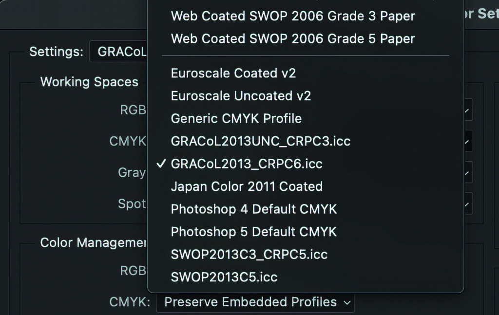 Figure 1: When creating a linear greyscale test image, ensure your CMYK colour space is GRACoL. Photos © Angus Pady
 When considering the development of a system for assessing colour and implementing quality control, we often overlook the significance and potential of the colour grey. Grey is more than a neutral achromatic colour that can’t decide if it’s black or white. Think of grey as the foundation of colour. It is the first thing to look at and is the most telling if things are going wrong.
My test images feature multiple four-colour grey balance images. One of the most difficult things to achieve is a linear greyscale. When creating a linear greyscale test image, always ensure your CMYK colour space is GRACoL (Figure 1). This ensures your CMYK values are correctly targeting your press.
What do I look for?
First is the blend. Do you see any transition issues? Are there any areas where the scale is not linear? This is a sign that the conversion did not work properly, or you have made an error creating your ICC profile.
The grayscale should be neutral and smooth (Figure 2).

Figure 2: An example of bad shadows.
The second scale, as shown in Figure 3, has been exaggerated but displays big issues in mid-tones. It has a strong cyan cast and no highlights.

Figure 3: The mid-tones are off in this example.
Grey balance and process control
A great advantage of utilizing grey balance for process control is its simplicity, practicality, and effectiveness. One method of evaluating grey balance on press is to place two grey patches side by side.
One patch should be composed of chromatic grey (C: 50 M: 40: Y: 40) and the second a true grey (K: 50). The goal is to get the two patches to look the same.
G7 and grey balance
When it comes to achieving grey balance on press, your CTP plate curves play a major role. The G7 method was created to accomplish a nearly neutral appearance when printing four colour images. Grey balancing is not a new technique; it has been a standard practice in photography for many years. Having spent a significant amount of time working with a drum scanner, I fully appreciate the importance of grey balancing when it comes to enhancing the quality of an image.
Based on my experience calibrating hundreds of presses using the G7 methodology, I can confidently say it’s a reliable process. I’ve observed press-to-proof matches that are very close. The secret to its effectiveness lies in creating individual curves for each press unit and keeping the CMYK colours within those units. The approach used here differs from the conventional dot gain TVI technique, as it employs distinct curve values for each colour instead of using the same values across the board. To achieve successful press calibration/fingerprinting, it’s essential to ensure the press is well-maintained and in a consistent condition.
As individuals, we have the ability to differentiate and assess colours that are placed alongside one another. Our sensitivity is particularly high when it comes to identifying variations within shades of grey.
Figure 4 demonstrates how simple it is to distinguish these differences in grey, as opposed to certain colours.
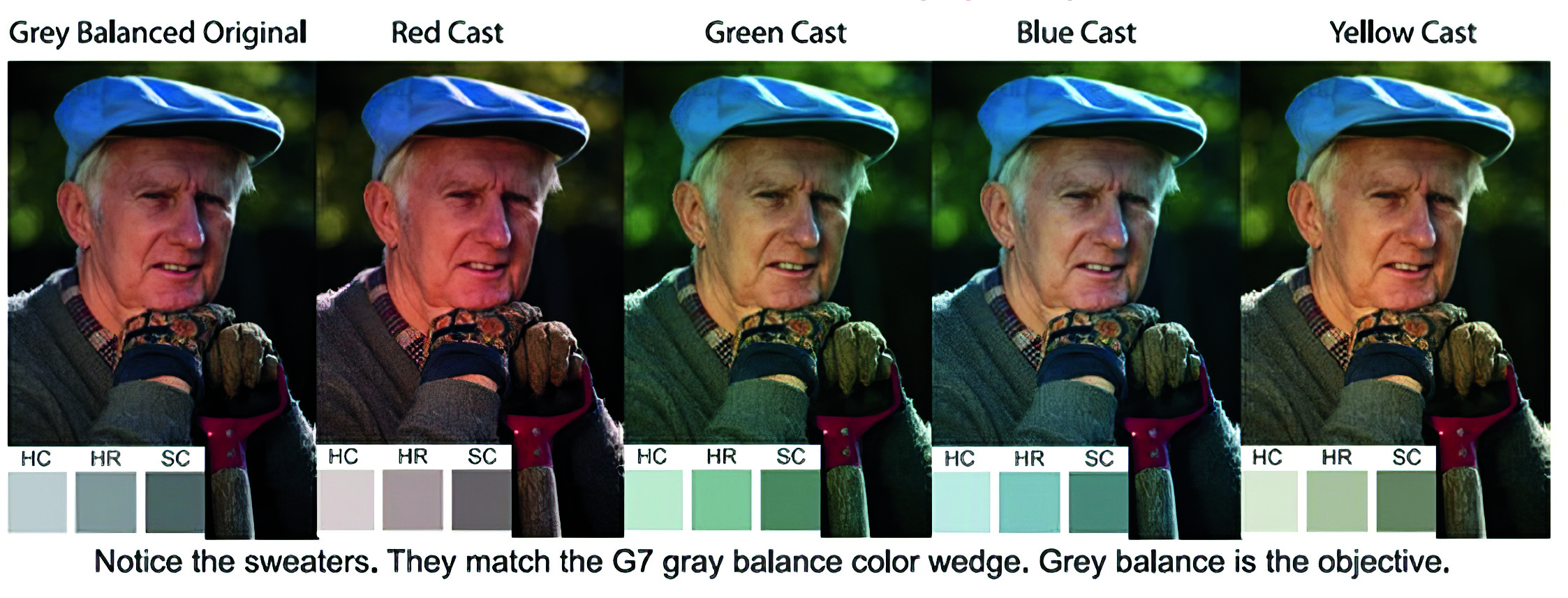
Figure 4: It is easy to detect colour differences with grey. Notice the sweaters. They match the G7 grey balance colour wedge. Grey balance is the objective.
Improper grey balance will quickly identify if the “spread” or deviation between CMY colours is too great. It is well known that with process inks in offset printing, inking and damping fluctuations show up more distinctly in 4C grey images than in coloured image areas. This is why grey balance patches in colour control bars have been instrumental in the indication of printing process disorders, if any.
Do not forget lighting also plays a huge role in how we perceive the colour grey. If you suspect lighting may be adding a colour cast to your images, take the sheet outside in daylight. 5000K or D50 tries to mimic a cloudy day at noon.
To summarize, if you are not using grey patches to evaluate colour, you are missing out on a valuable tool.
Angus Pady is a G7-certified expert that has helped customers resolve colour management challenges for over 30 years. He can be reached at angus.pady@fujifilm.com.
This article originally appeared in the May/June 2023 issue of PrintAction.
Print this page