Features
Business
Training
On the forefront of print
TAGA 2019 highlights the diversity of new print technology advancements
June 11, 2019 By Martin Habekost
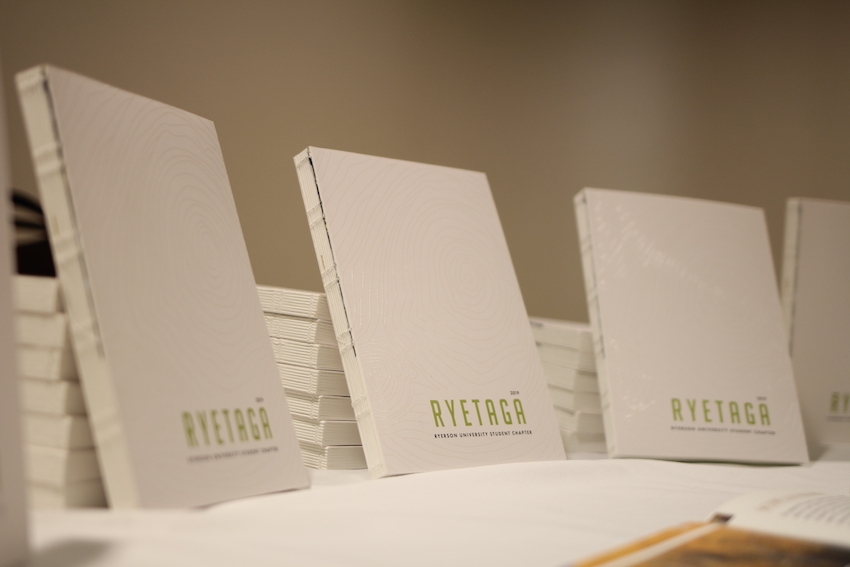 The RyeTAGA team worked closely with industry on its 2019 journal, printed on paper from Mohawk Paper donated by Spicers at Canon Canada, featuring digital embellishments from C.J. Graphics and binding done at Beck Bindery. The NFC tags were donated by Jones Packaging. Photo courtesy of Julia Forrester
The middle of March is the time when the Technical Association of the Graphic Arts (TAGA)’s Annual Technical Conference takes place. This year the conference was held in Minneapolis, Minn., from March 17 to 20.
The conference is not only for researchers to present their findings, but also for PIA InterTech Award winners to present their innovative solutions, while post-secondary students from Canada, the U.S. and France show off their work in the form of student journals. These student journals contain research work related to the graphic arts industry conducted by students. The TAGA student chapters compete for the Kipphan cup, awarded annually to the best student journal. The Ryerson TAGA, also known as RyeTAGA, is the sole Canadian student chapter and has won this cup six times in the past and went to the conference as the defending champion. Unfortunately the RyeTAGA student chapter did not defend the cup, but received an award for the best electronic publication portion of the journal. Meanwhile Ryerson University’s Graphic Communications Management (GCM) student Julia Forrester won the Harvey Levenson Undergraduate Student Paper Award for her paper on expanded gamut printing.
The conference always starts with four keynote presentations on the Sunday afternoon. The keynotes are there to inspire the attendees to think outside the world of graphic arts and printing. The first keynote was delivered by Jeff Gomez from Starlight Runner Entertainment, who spoke about immersive media being the new language of enchantment. Gomez talked about how successful storytelling is becoming more and more important. “For the past couple of decades, media has engaged our eyes and ears at the expense of our other senses. Lately, young people have been yearning for something more. They want to imagine. They want to touch,” he said. He told his story about how he became part of the world of printing, images and storytelling. According to Gomez, variable data printing will result in big revenue. This quote from his closing slide is very indicative of where things are headed: “We are now capable of surrounding people with digital communication and the graphic arts.”
The next keynote was presented by Dan Dennehy, Head of Visual Resources from the Minneapolis Institute of Arts. He spoke about new approaches to documenting cultural heritage. One of the challenges they face is the long-term readability of eBooks. Dennehy said Getty has developed a platform that allows an eBook to be produced in various formats. The most interesting part of this keynote was how the Minneapolis Institute of Arts uses photogrammetry to make many of their collection items that are not on display to the public. The items are first 3D scanned, and then the images are cleaned up and processed so the viewer can see the items through a computer or tablet. There is a range of challenges for 3D imaging, including: Colour accuracy, reflectivity and surface appearance, verification of geometric data and viewability across different platforms. The current library of 3D scanned items can be viewed at https://sketchfab.com/artsmia.
Fritz Horstman, Artist Residency and Education Coordinator at the Josef and Anni Albers Foundation, delivered the third keynote: A look at the interactivity of colour, art and teaching of Josef Albers. Horstman set the stage by sharing the historic background of how Josef Albers was part of the Bauhaus, first in Weimar (1919 – 1925) and then in Dessau (1925 – 1933), Germany. Josef Albers was running the preliminary course at the Bauhaus. In 1933, Albers immigrated to America and started to paint and work with colours. His signature series, Homage to the square, features three or four squares set inside each other, each in a different colour, with the squares slightly gravitating towards the bottom edge. Although this presentation was vastly different from the other keynotes, it provided attendees with an opportunity to think about how different colours and materials interact with each other, perhaps in a way they hadn’t thought about before. In my opinion this presentation highlighted where the roots for certain colour interactions were laid in the first third of the 20th century.
The last presentation, This is your brain on paper, was given by Daniel Dejan of Sappi Paper. He spoke passionately about how all the senses get engaged when you read on paper. Many studies have proven that there is a larger mnemonic (aiding or designed to aid the memory) retention when reading something on paper versus reading the same information on a screen. He noted the following as some of the benefits of reading on paper:
• Lowered heart rate and blood pressure,
• More in-depth reading/increased ability to absorb more information,
• Increased mnemonic retention, and
• Better understanding of the content.
When you read the same information on a digital device, you go into ‘skim mode’ and start searching for keywords. You are reading for speed, you have a lower retention rate and a diminished understanding of the content, Dejan noted. Print still has its checks and balances, while with digital, everything gets uploaded and there is no filter in regards to the content.
This concluded the Sunday keynotes. All were well received by the audience and many attendees struck up conversations with the presenters during the welcoming reception that followed the sessions.

The 2019 RyeTAGA group, comprised of third-year students from the Graphic Communications Management (GCM) program at Ryerson University, and chapter advisor Martin Habekost. Photo courtesy of Aidan Kahane.
The Monday and Tuesday of the TAGA conference were dedicated to presentations by industry and university researchers, as well as PIA InterTech Award winners. The presentation by Axel Fischer from Ingede, an organization that evaluates the deinkability of printed materials, focused on the deinkability of prints made with inkjet technology.
Fischer noted that if a batch of paper contains 2-percent water-based inkjet printed material, the batch will be unusable for deinking with the current process that is being used. Inkjet printed material that has been pretreated before inkjet ink hits the paper, preventing it from being absorbed into the fibres, can be deinked. As well, prints made with dry toner technology can also be deinked. He noted that prints made with cross-linked inks – inks that have been ‘dried’ by UV light exposure – pose a problem for deinking, meaning new digital print technologies are not friendly for being deinked… at this time.
MacDermid Graphic Solutions’ Dan Fry presented an innovation in flexo plate technology for printing on corrugated material. The new MGS Anti-Fluting plate technology, Fry explains, is designed to minimize the washboard effect that is typical when printing on corrugated material and aims to reduce the board crush that can happen in the printing nip. Described as being very durable, the plates boast excellent ink transfer and low dot gain.
Keeping with the topic of printing on corrugated material, EFI’s Liz Logue gave a presentation on the Nozomi C18000 digital inkjet press, which won an InterTech Award. Along with highlighting the technological innovations that have made the Nozomi a reality, she noted the corrugated market will adopt inkjet as a valuable avenue of producing corrugated materials in the next five to 10 years. (More on the Nozomi C18000 can be found in my article, Change on the horizon, published in the April 2019 issue.)
David Biro from Sun Chemical gave a very good presentation on how UV-curing works. He explained the difference between UV-curing with mercury doped lamps and UV-LED lights. Both curing processes pose challenges for ink manufacturers to have the correct chemistry present in the ink. An ink formulated for UV-curing with mercury doped lamps cannot be cured with UV-LED lights and vice versa, he noted. Biro also showed how the variation of an ink formulation can help improve the curing rate of an ink.
Ganesh Kumar of colourvision.org.in, an organization that strives to raise awareness of colour vision deficiency, gave a presentation on the development of a new test tool to identify colour blindness. The test, he explained, had to withstand wear without losing its physical integrity, as it would be handled by many people. After testing on different substrates using various printing technologies, they determined that printing the Ishihara plates on 200 mil Polyester using electrophotographic print technology performed the best. This was a rather interesting presentation which took the audience on the journey of discovering the best possible solution for a problem.
Next was Mustafa Bilgin from the Bergische University in Wuppertal, Germany. He had developed a coding system, similar to a QR code, with elements that react to heat, light and water. These elements have the ability to change the message of the code, which can be read by a code reader, he explained. This presentation showed how initial research in this type of area is done and how various materials and optical code patterns are evaluated for their suitability.
Another InterTech Award presentation was made by Dr. Danny Hall from Global Graphics Software. His company has invented a screening technology for inkjet printing that helps to minimize and/or eliminate the problems from directional streaking that can be the result of missing nozzles, nozzle timing jitter and intra-screen defects. This can result in banding and other artefacts. The examples shown in the presentation were quite impressive. This technology is worth looking into for anyone having an inkjet production device in their printing company.
Several presentations at the conference addressed expanded gamut printing, one of which was given by Kyle Hargrove of CGS. He explained the difference between extended and expanded gamut printing. Extended gamut printing, he noted, is extending the gamut of traditional CMYK by printing these colours at higher densities and thereby extending the gamut. This is denoted as XCMYK. Meanwhile expanded gamut printing is traditional CMYK plus orange, green and violet, going from the four-colour process to seven-colour process. What does this mean for a printing company? If you have a flexo print shop, it means you can standardize your anilox roller inventory. You don’t need to keep a wide variety of anilox rollers, since you can more or less run the same anilox rollers for every job. And since you run the same anilox rollers all the time, they also wear out faster than before. Alternatively you have fewer wash-ups, since the inks stay the same for every job and you only need to change the plate cylinders and substrate. This results in a drastic increase in press efficiency, he said. He shared the cost analysis of a print shop his company worked with. All cost factors were taken into consideration and in the end, the customer saw a 35-percent savings in hard costs.
Next, Jodi Alejandro from CrossXColor and Thorsten Braun from ColorLogic gave a talk on the number of test patches needed to characterize a print process with four and more colours. As a measure of the quality of the test chart, the following two characteristics were chosen: DE average and 95% percentile. An example was done in relation to standard test charts for GRACoL. It showed that after about 150 patches, the average DeltaE is 1 or lower, meaning more test patches are not needed. One of the main takeaways of this presentation was that a high quantity of test patches does not automatically result in a better test chart — test chart generators and colour models need to be optimized to better reflect this.
Hanno Hofstadt from GMG gave a presentation on the characterization of multicolour printing and creating a meaningful test chart. Hofstadt showed that if the same logic behind the IT8.7/4 test chart was applied to expanded gamut printing, the test chart with the same resolution (10 to 15 percent, nine steps) would result in a test chart with approximately 5 million patches. Even if the resolution was reduced to only four steps, it would still result in a test chart with almost 17,000 patches, he said. These are all not practical approaches to creating test charts for expanded gamut printing, he explained, so what could be done to reduce this set of test patches to a maximum number of 5,000? Some approaches to limit the number of test patches is to reduce the Total Area Coverage (TAC) from 400 to 280. Also, limiting the number of colours involved in overprinting inks will result in a reduced number of test patches. For seven-colour printing with four steps and four overprinting inks, the number of test patches is reduced to approximately 4,000. Since most people printing with expanded gamut use AM-screening, so-called screen-clashes need to be avoided. Why is that? Well there are basically only four screen angles available, so certain colours need to share a screen angle. Most likely these will be opposing colours, like cyan plus orange or magenta plus green.
Currently there is an initiative from Idealliance to create a common expanded gamut test chart. It should be suitable for offset, flexo, gravure and digital printing, be supported by all major profiling software vendors and provide a reasonable CMYK characterization too. Another stipulation of this initiative is the test chart should not be more than four letter-size pages big. At the end of his presentation, Hofstadt demonstrated that GMG’s OpenColor software solution takes into account these various factors and creates a dynamic test chart layout.
One of the last presentations of the conference was given by Professor Liam O’Hara, who discussed expanded gamut printing in flexography. His study focused on the influence of the chroma of the inks on the gamut volume. Without going too much into detail, it can be said the greatest chroma of orange, green or violet does not mean the largest possible gamut volume. Using a low chroma version – up to only 70 percent of the original ink concentration – can make it possible to achieve more Pantone colours than using full chroma inks. The ink film thickness of the inks appears to influence the gamut size beyond its influence on the chroma of the solids.
Overall it was a great conference, and in my opinion, one of the best TAGA conferences put together. The variety of the topics was very broad and the research also showed that specifically in the expanded gamut printing area, a lot of work still needs to be done to fully understand how this technology works best and can be used by printers. I look forward to next year’s conference to discover what developments have since taken place.
This feature was originally published in the June 2019 issue of PrintAction, now available online.
Print this page