Features
Colour Control
Premedia
Measuring and correctly specifying a light source
Ryerson's Abhay Sharma considers different ways to correctly specify a light source using the colour temperature scale and official CIE illuminants
September 4, 2020 By Abhay Sharma
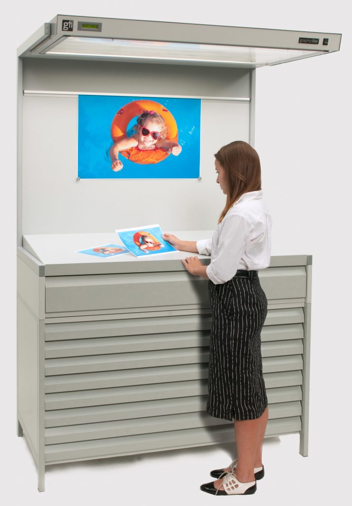 Viewing booths are used to create standard viewing conditions and are a vital part of a colour management system. Photo: GTI.
 Whenever we view coloured images, whether via a web browser, on an iPhone, in a magazine advertisement, or in a store, it is important to understand the effect of lighting. If the light source is very yellow, it will make the object look yellow; if the light is blue, it will make the object look blue.
The colour of a sample can change depending on the light source it is viewed under. In everyday colour evaluation we can deal with a number of different sources, but only as long as we understand and accommodate the light’s characteristics and the effect it can have in terms of colour.
In this article we consider different ways to specify a light source using the colour temperature scale, e.g. 5000 K, and also official CIE illuminants, such as D50. We make real measurements outside in the street, and show how close Toronto daylight agrees with theoretical expectations!
Effect of lighting
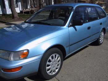
During the day a car may look blue (top), while at night under sodium-vapour street lamps, it can look silver or gray (bottom).

To illustrate the effect that light can have on the colour of an object, consider the example of a car parked in the road. During the day, the car is illuminated by daylight and it looks blue. After dark, when the car is only illuminated by a street lamp, it may look a totally different colour, perhaps silver or dark gray. Why does this happen?
During the day, daylight consists of “all the colours” which reflect off the blue paint of the vehicle and we see the blue colour of the car. After dark, the car is only illuminated with light from a street lamp. Street lamps are often high-pressure sodium-vapor lamps that emit most of their radiation as a very narrow spike in the yellow part of the spectrum. The blue paint of the car does not have much reflectance in this part of the spectrum, and so very little “colour” is returned to the observer, and as a result the car looks devoid of colour and neutral – silver or gray.
Colour temperature
In colour management, there are different ways to describe the colour of a light source. A convenient method is called the colour temperature scale. The idea of colour temperature can be appreciated by considering the progressive heating of a piece of metal. As objects are heated, they get hotter and begin to glow and emit light. The colour changes as objects get warmer, so an object goes from dull black to deep red then bright red and finally to “white hot.” It is therefore possible to describe the colour of a light source by temperature. When used in this way, the temperature is called colour temperature. In the colour temperature scale, lower colour temperatures are redder/warmer and higher colour temperatures are bluer/colder.
Colour temperature is measured on an absolute temperature scale and has units in Kelvin (K). A tungsten source may have a colour temperature of, for example, 2800 K. (No degree sign is used with K, so colour temperature is not written as 28000 K but simply 2800 K.) Typical values for common light sources are: high-pressure sodium vapor (used for night-time street lighting in the car example), 2100 K; photographic studio lamp, 3400 K; electronic flash, 6000 K; average daylight, 5000 – 6500 K; artificial daylight compact fluorescent lamp, 6500 K; uncalibrated computer monitor, 9300 K. The colour temperature scale provides a succinct, numerical means of specifying the colour of a light source and is widely used in colour management.
Spectral Power Distribution Curves
There are many types of light sources. Some are artificial like tungsten and compact fluorescent light bulbs, and some are natural sources, like daylight. Light sources can have very different operating principles, which results in a wide variation in the inherent characteristics of the light. The Kelvin colour temperature scale does not fully reveal all the characteristics of the light, so we can also use a spectral distribution curve. The spectral graph describes the relative amount of power or energy at each wavelength and is technically known as a spectral power distribution curve.
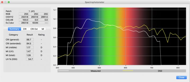
Daylight was measured in Toronto, Canada (white line) and shown to be very close to CIE Illuminant D50. Screenshot is from basICColor catch 5 colour management software.
From the examples, we see that daylight tends to be well balanced with emission throughout the spectrum and thus the “colour” of daylight is more or less neutral. A fluorescent or LED light source has some dominant peaks in the blue and green part of the spectrum – the illumination from this source is very spiky.
From the graphs it is clear that each source has very different characteristics. Daylight that originates from a hot glowing sun is essentially incandescent. Incandescent sources have a graph with a continuous line. Other sources, such as fluorescent lights, are not heated up and therefore do not operate this way. These lights contain a gas that is excited by the discharge of an electric current, which in turn excites the phosphor coating of the tube, which glows, giving off light. The chemical composition of the coating can be altered to adjust the colour temperature of the emitted light – which is why you can get different colour temperature lights at Home Depot!
By using spectral graphs, we can clearly see the smooth continuous nature of some sources (daylight) vs. the spiky response of others (fluorescent lamps and LEDs). The spiky nature of fluorescent sources can cause problems such as metamerism, when these sources are used in viewing booths.
CIE Illuminants vs. real sources
With so many different types of light sources in everyday use, a few common light sources have been chosen and adopted as universally accepted standards. Periodically over the years, in response to user needs, the Commission Internationale de l’Eclairage (CIE) agrees on the name and specification of an illuminant and publishes the spectral power graph for the colour community to use.
A CIE illuminant is a theoretical spectral power curve that has been established as a standard. The spectral curve can be an average of light sources and is not a real, actual light source. There are physical standards for the kilogram and meter, but a CIE illuminant is just a theoretical construct – it is a spectral graph – and there is no “golden standard” tungsten bulb in a vault in Paris!
Over the years, the CIE has defined a number of illuminants that range conveniently in letters A, B, C, D, E, F. Illuminant A is represented by incandescent lights (tungsten filament bulbs). These devices have a colour temperature of 2856 K. Illuminants B and C are daylight-type illuminants, but they are no longer in general use. They were made by placing a liquid cell containing a blue copper sulphate solution in front of illuminant A. D illuminants are daylight-type illuminants. Illuminants D50, D55, D65, and D75 have colour temperatures of 5000 K, 5500 K, 6500 K, and 7500 K, respectively. D50 and D65 are widely used as illuminants in printing and imaging. European countries often use D65. Illuminant E is an imaginary, hypothetical equi-energy illuminant. Illuminant E is used in some colorimetry calculations. Series F illuminants relate to fluorescent lights.
It should be noted that the spectral power distributions for an illuminant, Illuminant D50 for example, is a representation of “standard daylight” and any actual sample of daylight might be different according to the geographic location, altitude, weather, time of day, and so on.
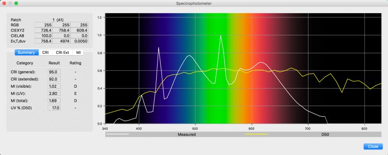
A light booth was measured and despite the spiky response of the LED source (white line), the booth can create light that approximates D50.
Lighting and light booths
A customer may visit a print shop and together with the printer may generate an excellent sample that is approved in a press-side D50 viewing booth. However, when the customer takes the samples back to the office to show their boss, under office lighting the samples may change colour and incur the anger of the manager!
If someone holds up a print and says they do not like the colours, the first thing to do is to ask them how are they viewing the print. If colour measurement for the print was done with settings that intended viewing for D50, the sample should be viewed under D50. The print is only intended for a specific viewing condition and may look different under other light sources. Another way to think of this is that if you have sent a print to your client and you want them to see what you see; they must view the print under the conditions you viewed and measured it under.
One way to create well specified and controlled viewing conditions is to use a viewing booth. Viewing booths have switches that offer D50, D65, or other illuminant conditions, such as settings for grocery store or clothing store lighting.
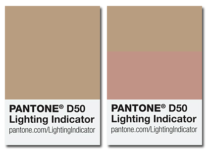
In the PANTONE® D50 Lighting Indicator, the top and bottom halves are different in non-D50 lighting. The two-inch sticker can be attached to colour proofs to check the lighting.
In printing and proofing, the light source used by the customer can be checked using the PANTONE D50 Lighting Indicator. In this small sticker, the top and bottom materials are different, but are chosen in such a way that they will look alike under D50 illumination. The sticker can be placed in the corner of a contract proof used to gain customer approval. The sticker will show whether the user is using a lighting condition that approximates D50. There is a D50 and D65 version and each cost around $2. The Lighting Indicator uses an effect known as metamerism, and the top and bottom materials are called a metameric pair.
Summary
We need to always remember that lights themselves have a colour and that colour can be passed on to the sample. We often “standardize” on D50, but strictly speaking, there is no correct light source for evaluating colour. What is more important is that we know the light source we are using, and we communicate that clearly to all involved. It is extremely important to establish agreed viewing conditions between the printer and the customer.
Whether we are considering a shade of lipstick or the colour of a sofa in a catalog, there are many different light sources in common use, but by correctly specifying the light source being used, we can accommodate their differences and ensure successful colour measurement and colour management.
 Abhay Sharma is a professor at Ryerson University, Toronto, and the author of a textbook – Understanding Color Management, 2nd Edition, Wiley, 2018.
This article was originally published in the June 2020 issue of PrintAction.
Print this page