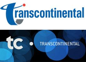

Transcontinental has refreshed its brand image. From now on, the company will be known as “TC. Transcontinental,” with its subsidiaries known as “TC. Media” and “TC. Transcontinental Printing.”
“As our customers’ needs have evolved, so have we. What customers rightly expect is proactivity, creativity, innovation, strategy, customization and market intelligence. Our new brand launch is a logical milestone in the disciplined roll-out of the development plan we began implementing in 2008 to strengthen our core operations and build new marketing communications services,” said François Olivier, President and CEO of TC. Transcontinental.
TC. Transcontinental has worked with Cohesion Strategies, a Montreal-based consultancy, and Bleublancrouge, a Montreal-based advertising and design agency to develop this brand strategy.
According to the company, the TC, along with its typographic style, has strong meaning for Transcontinental:
Beyond the truncation of the word Transcontinental, the ‘t’ in the new ‘tc’ stands for technology, while the ‘c’ represents community. In the chosen typography, the bold, upright ‘t’ embodies confidence and solidity. The ‘c’, with its generous opening, signifies willingness to communicate. The red dot from the former logo is transformed into a black one, which represents the digital economy as well as the point of contact between the company and its customers.
Advertisement
Print this page
Advertisement
Stories continue below
Related